York, England. Initial post 2008-10-20 with more explanation on 2008-10-21.
Here's a description of how we use computers at home to make life much easier. It's a shame we have to write the programs to do it, so where practical we use existing solutions, typically open source ones - for example, we're using eGroupware to help manage mail, contacts and calendar.
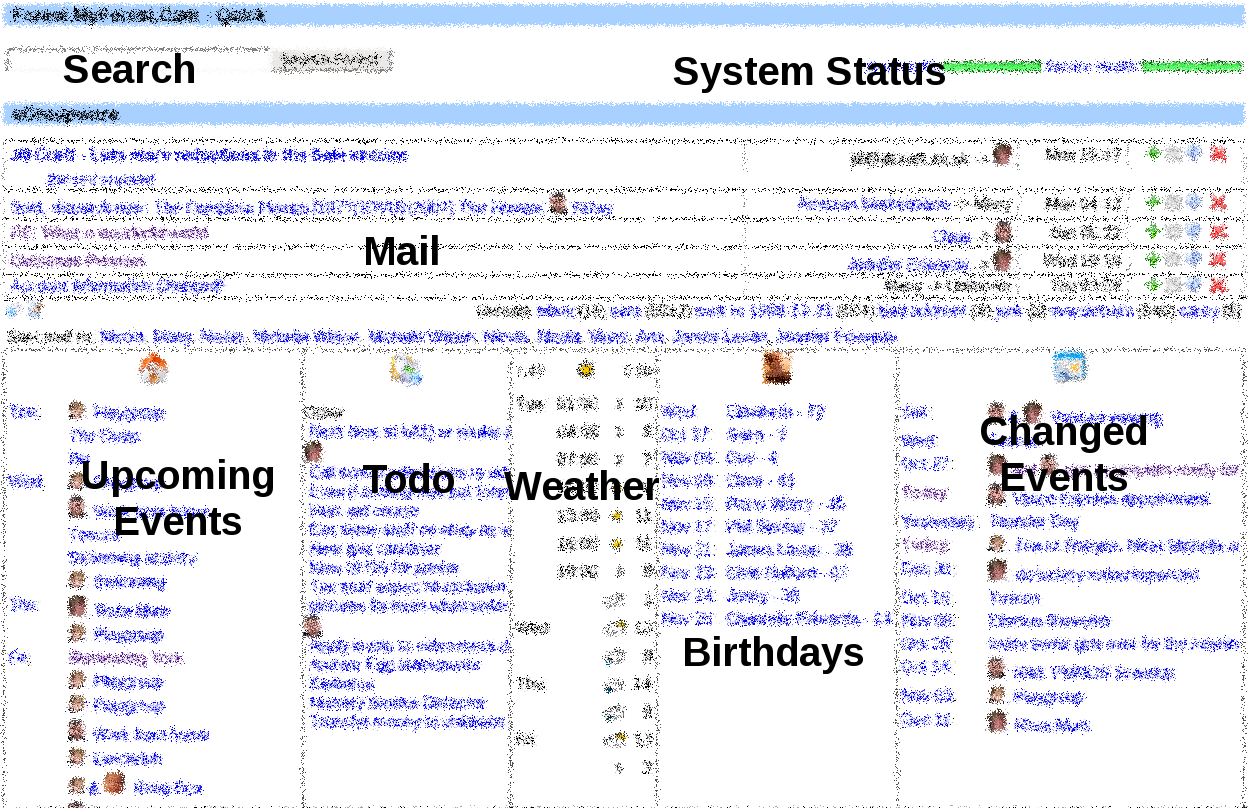
By collecting together lots of information into one place it's very easy to get an overview:

A picture is worth a thousand words, but maybe an icon is worth five. We use images alot to show people, weather conditions and so on without taking up lots of space:


For larger images we use convert to get nice little TMS friendly PNGs and identify to get the rotation correct (thanks in part to the EXIF information our Canon 350D records.) We use a similar approach to generate the thumbnails for the public gallery:


By ordering the content in descending order based on the modification time it's easy to see what other team members have been changing. You'd achieve a similar effect with an RSS feed. We still render the object showing it's intrinsic date because that has more relevance than when something was changed (most of the time).
A neat little hack allows you to see if there’s something interesting in the taskbar / process manager of a suitable Window Manager on any browser. This saves you having to install some sort of notification agent on the client.

Today we have things such as
I got rid of the financial summary from the portal as I found I was looking at the portal in areas where I didn't want to expose that sort of information in an easily digestable format!
The platform we're basing this on is Nutch. We are showing images as thumbnails and mail-file subject lines amidst other results. Basically, the “subject” of the search result is extracted from the content instead of showing the file name / location.
It's possible to enhance the search results further by adding actions that you can perform on them. For example you could implement voting / exclusion in the future. Seeing as I have access to the search engine ranking it could be adjusted to take account of this extra information.
Line up results on a stream rather than creating a new line where possible. Combined effect is that searching for just images gives a contact sheet result:
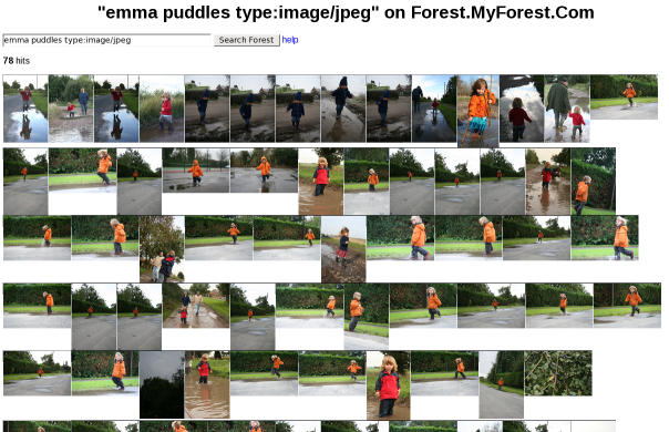
We can span multiple sources by injecting results into the search index or by simply rendering content in a crawlable form (e.g. a contact as a web page). We can also search one space (say filesystem) and expose on another space (e.g. website) with suitable re-directions
I'm looking at how SPARQL may help me get better results and maybe automate some of the jumps to relevant content. For example I'd like to identify Emma or Cameron in a photo and query on that meta data rather than relying on folder structures. SPARQL will allow me (or the system) to generate queries that are more focussed. It would be even nicer if I could find an open source facial recognition engine to scoot through the 25,000 images we already have.

Link to third party systems to try and find suitable images (e.g. eBay listing photo is much better than Item IDs)
Link mail addresses to underlying contact. This means our "nick name" for a contact is the one we see rather than what their mail system sent out. In the example we only know one "Claus" so the name can be shown more concisely than "Jennifer" which occurs more than once in our contact list. Where available an image can also be used. Seeing the link helps to give an appreciation of the legitimacy of the mail. Also, it highlights when a sender is using varying addresses that you may not have recorded - the obvious example being when someone is mailing from a new account. In the example "jill@jillcraft.co.uk" is not in our listed of trusted addresses and so we'd be on our guard (especially as we couldn't get a text preview.) This obviously raises the thorny issue of how legitimate the source address is and at the moment we're hobbling along with Sender Policy Framework.
Tag mail subjects so that quality can be seen on unsophisticated clients (e.g. over IMAP). At the moment we have a "+" for responses and a "-" for borderline spam or completely unknown sender addresses.
We generate an intelligent preview of unread content which is extracted using rules about how to ignore certain types of content. The two status mails about "MyForest.Com/HTTP" in the example are from Nagios and contain much more information than you can see. However much of it is boilerplate so we can skip it when getting a preview.
By summarizing the to/from info into a single column we reduce space required - this is very useful when combined with images. In the example the two status mails are detected as internal mails so the to/from info is suppressed to make more room for the subject (not that we need it in this case.) The "Account Information Changed!" mail puts you on your guard as it's from "Many" to "Unknown" - contrast with the mail from "Claus" to me.
We use mythtvosd which is an on-screen display ticker for MythTV so that new mails scroll past if we're watching TV. This makes email part of everyday life around the house. We turn it off when we have visitors!
Mail is automatically filed based on rules such as detecting that mails from this address appear in the “newsletters” folder. This keeps the overhead down.
If a message claims to be a response then it's cross-referenced with outgoing mails to see if it really is a response. We keep all our mails, but this would provide a good level of filtering even if you only had say a month's archive. As we have the full archive we have the luxury of being able to discard any fraudulent mails.
Provide multi-folder summary of unread items to attract attention to auto-filed items. We don't need to see the folder structure for any other reason so this saves complicating the UI:

Provide summary of sent mails – useful for a team to see what communications have occurred
Filtered views for portal (e.g. Todo list) but still unified list for less sophisticated clients
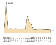
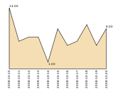
Charts showing mail volumes (incoming, archived etc) to highlight exceptions. The first chart is incoming mail volume - the peak is around 2,5000 mails - clearly quite exceptional. The second chart is for archived mails so I can get a feel for how active the system is:
We aim for a reasonable representation of the date that balances compactness, time to interpret and dis-ambiguation. "Wed" and "Sat" are within the next six days. Dates within six months in the future or three months in the past are shown without years.

We have a list of recently changed entries so we can see what’s changed without having to chat with each other about it. The fuzzy date example above is the dates extracted from a list of events that have changed recently sorted in descending order of modification date. In the full version I can see that Carey has booked an appointment for Saturday for us both and on Wednesday Tescos are coming (which we certainly don't want to talk about each week)
List of recently changed contacts so you can find the ones you’ve been working with quickly.
Link to BT and join up phone numbers with contacts database. Use name if found, else show number and link to search engine to find who they are - this improves the cache of numbers we have assocaited with people. The details of the call are available on a tooltip in case you want to know the cost or duration for example.
Comparison of content relating to one child within a time window that maps to the age of the other child. As this is presented as an RSS feed with images shown where possible it gives a visual comparison that might spur you into action if you forgot to offer some experience to the next child in line.
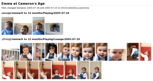
RSS feed of recently changed files to confirm changes are as expected
Scan sources for houses, then extract pertinent content and insert into local wiki (notably images, but also remove spam from property description)
Wiki allows local user discussion without showing to other buyers you are in competition with
Use “recent changes” to show list of things that are new – maybe take an RSS feed
Add voting buttons - in our example any user could "bin" a house to indicate it was definately not plausible or they could shuffle it into the "maybe" pile
Plot house position on map and use image
Collect information from many source and aggregate onto a single page
Interpret names and translate to user friendly version using mapping. Possibly some regex
Show balance and graph per account
Provide totals – possibly by sub-group
Link to underlying content and also the P&L for each account per period
Where entry in one account is aggregate of another have some representation, e.g. link to other account. Use case: credit card payment from current account is aggregate of all credit card entries. Sometimes referred to as allocations.
Provide daily performance updates for pension – possibly as a graph – to allow customer to make timely decisions
Provide RSS feed of recent transactions so that user can spot unexpected transactions really soon
Local file, per folder in our case, to allow files to be tagged for publishing. Can extend file browser to change state or work with custom app / web site. In some cases I even manualy edit the file for speed.
Generate different views: folder hierarchy, timeline, geography, people,...
Share playlists between car, computer, TV, media player
Send email when voicemail arrives
Include link to voicemail
Include voicemail as attachment
Re-encode voicemail into other formats